A focused UX audit and lean design iterations that got an Australian sustainable swimwear brand's site moving again.
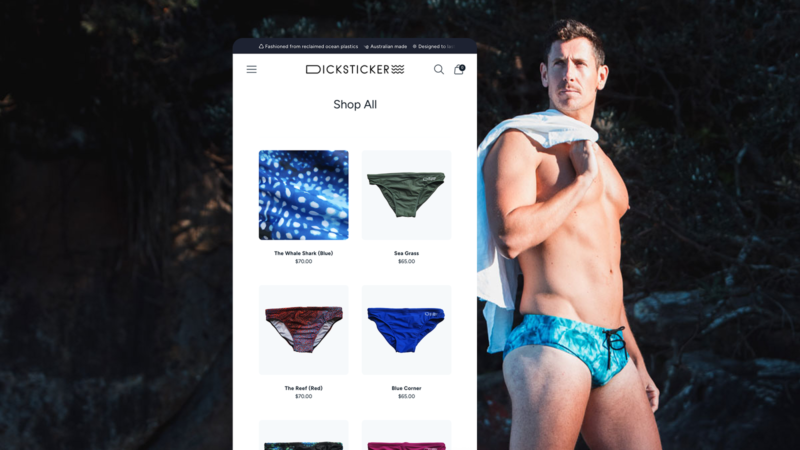
Dicksticker swimmers are made from reclaimed ocean plastic. The product had fans, but the site had barely been changed in years and the experience stopped at the website.
I came on to fix the site and improve key performance metrics, and to extend the brand experience across other digital touchpoints, meeting our audience where they are.
Outcomes
Orders up 9x and revenue up 7x since launch, from a small base.
Bounce rate down 32% with conversion rising from 1.68% to 1.96% in a month and no extra ad spend.
Up next: Audit
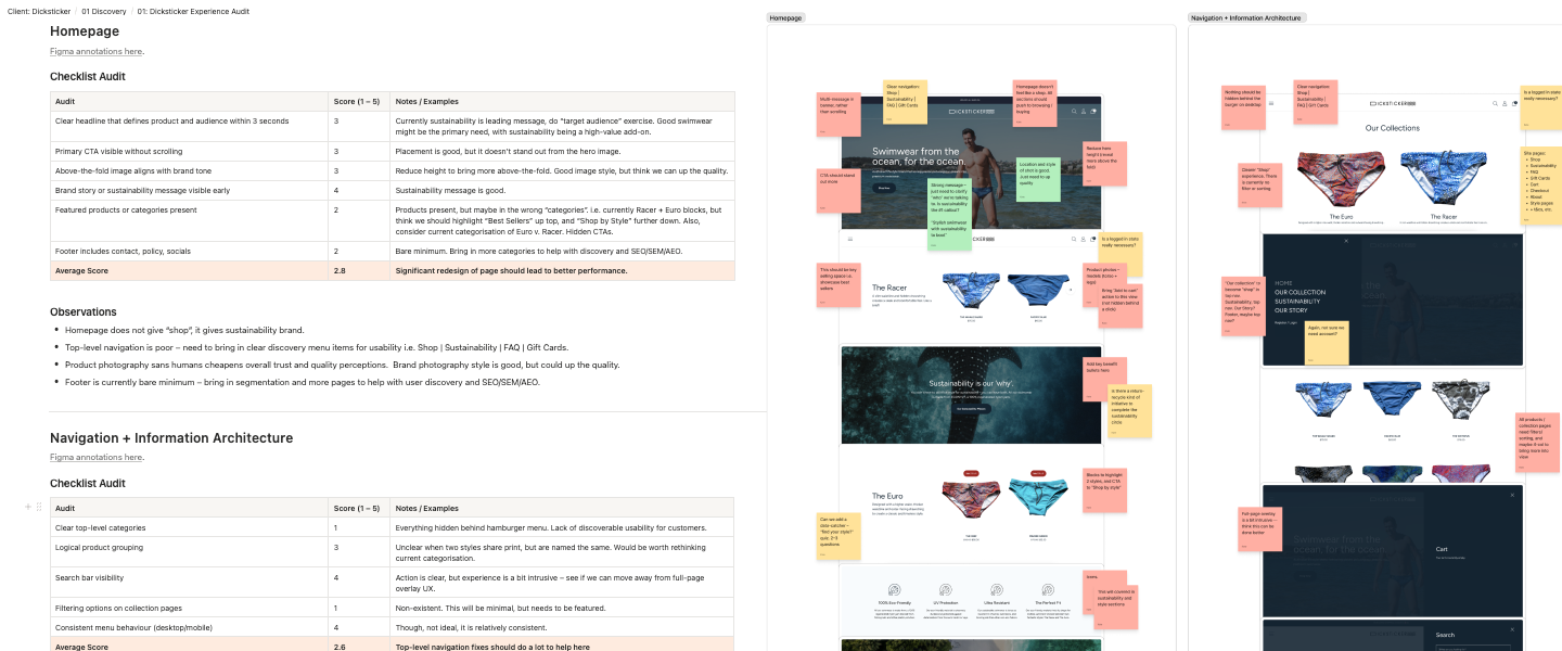
Bounce rate sat above 80% and checkout abandonment was high. People were finding the site and leaving before they bought. A quick UX audit found:
Hidden navigation: Key links sat behind a hamburger menu with a thin footer.
Mobile browing was slow: The device most visitors used showed one product at a time.
Thin, templated content: Generic icons and inconsistent photography, mostly flatlays.
The wrong lead message: Sustainability came first when comfort, style and performance are what bring shoppers in.
Up next: Fixes
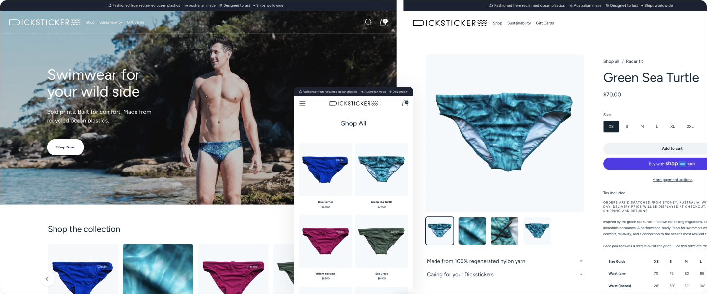
The existing Shopify theme was restrictive and limited what we could change without a full rebuild. We decided to test growth with a Stage 1 rollout before investing in a rebuild, so we made the highest impact changes inside the theme, measured them, and left anything bigger for a later stage.
Browse
A two-column mobile grid built with custom code, clearer navigation and a shop-by-fit split between the two styles.
Trust
A trust bar, better photography, refreshed testimonials and an FAQ page so shoppers could answer their own questions.
Message
Style, comfort and quality lead, with sustainability as a bonus. "Bold prints, built for comfort. Made from reclaimed ocean plastic."
Up next: Reach
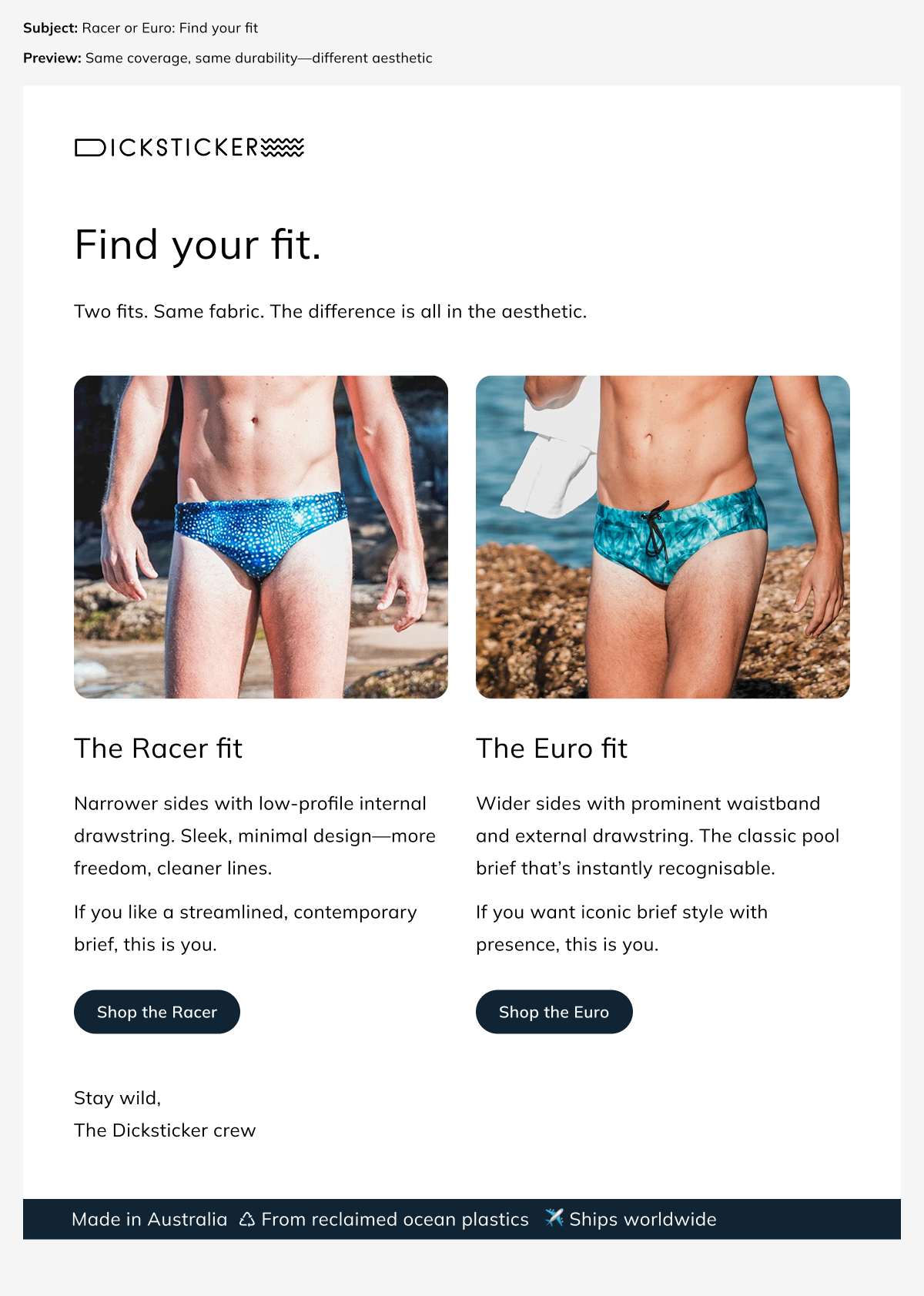
Email: A welcome and post-purchase series are live. Improving the abandoned cart series is next.
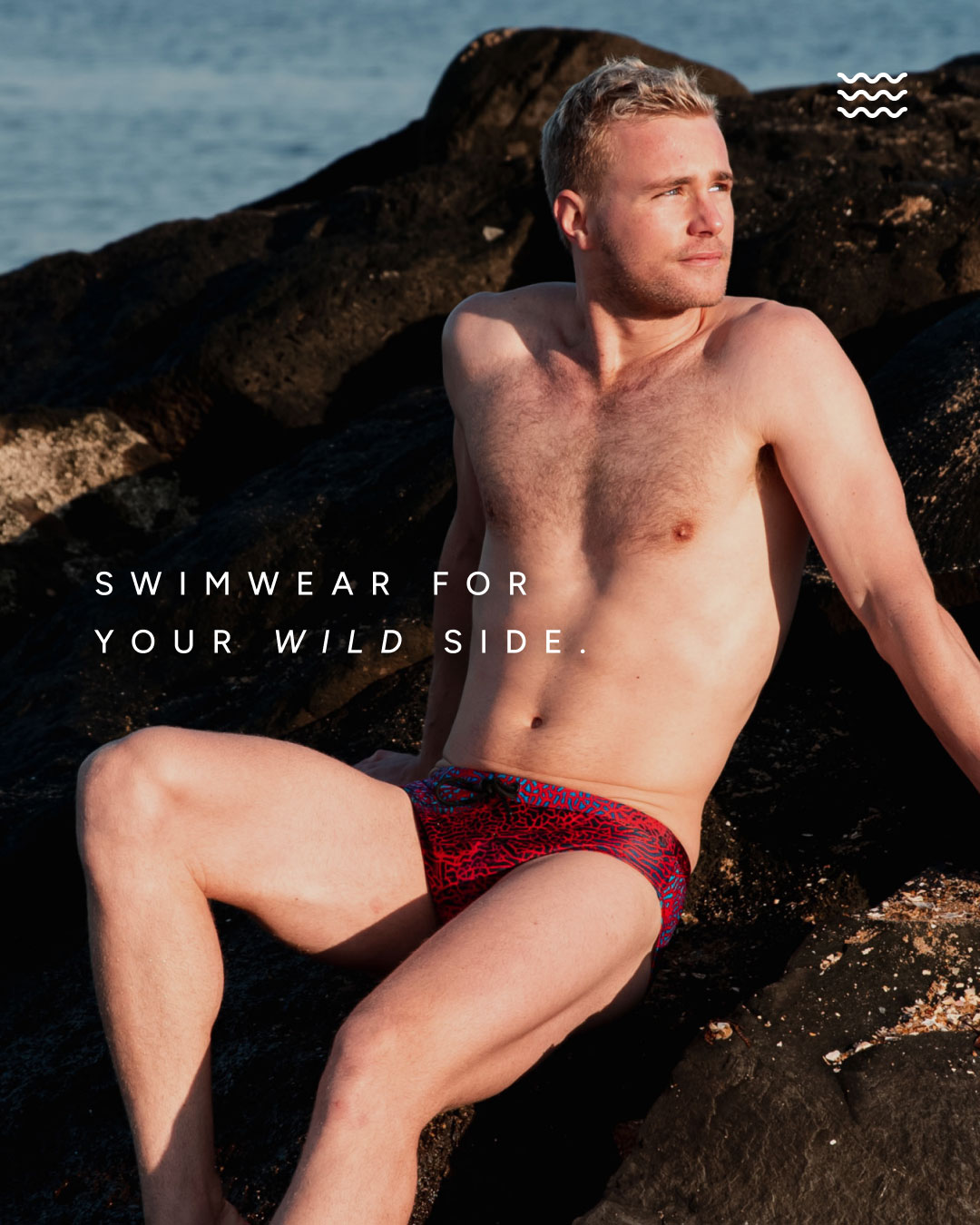
Paid social: The brand's first meaningful ad spend in years. It landed in the off-season, so it stayed small and was about testing, with budget saved for spring and summer.
Organic social: Posting ramped up to keep the existing audience engaged.
Up next: Impact
+94%
Sessions
3x
Conversion
9x
Orders
7x
Revenue
Note: Growth figures are from a small base. Stage 1 and the first paid social spend went live within days of each other, so the early jump reflects both.
Converting better: Orders grew faster than sessions, so a bigger share of visitors are buying.
Bounce rate down: It feel from 83% to 51% post-launch, drifted back up, and is improving again, still well below where it started.
Holding without extra spend: Conversion rate has steadily grown, sitting at 1.96%, and sales have held steady with no increase in ad spend.
Fasion e-commerce was a new space for me but as I suspected, the approach is the same. Whether it's a store, a startup feature or an internal tool, the thinking holds: understand the user, find what's in their way and improve the numbers that move the brand forward.
Stage 1 and the first ad spend went live together. Traffic was so low that we needed paid visits to test anything at all, so it couldn't be avoided, but it makes it harder to connect results to specific fixes. Now we have a good baseline to continue to grow from, one change at a time.